

StudyPlanr. is a digital study planner app that uses the power of spaced repetition to help students manage their studies better. It eliminates the the decision fatigue a student might face, when deciding what to study next. The app caters to students of all ages and from all walks of life.
Project Details:
Part of Udacity’s User Experience Design Nanodegree.
Duration:
2 Months
Key Skills:
Ideation, Interviews, User Flow, Affinity Diagram, Sketching, Information Architecture, Wireframing, Visual Design
PROBLEM
The total number of students in higher education worldwide is expected to reach nearly 380 million by 2030. As digital learning has become a necessity, there is also a steep increase in the variety of study materials. Students can quickly become overwhelmed with the amount of information they have to go through. Here, retention becomes a big problem. If students can recall what they had studied effectively, they are much more motivated to keep up with their studies, also they are calmer and happier.
SOLUTION
The solution to this problem was to create a mobile app because 79% students use smartphones for online learning and the percentage is only going to increase. For the MVP (minimum viable product), there were few features which were absolutely needed. These included the feature of being reminded of your revisions based on the spaced repetition algorithm, the ability to visualise your upcoming tasks on the calendar, and to be able to see one’s progress throughout the day. Users also cared about having a community online which helps with accountability.
To come up with the solution, I used multiple methods, like: secondary research, competitive research, user interviews, affinity mapping, empathy mapping, personas, user flows, usabiltity testing with wireframes, low fidelity and high fidelity prototypes.

PROCESS
To reach a solution, I used the Double Diamond process model.

01 - DISCOVER
The first thing I did after deciding on the problem, was to conduct secondary research. The purpose was to find out how feasible it is to create such an app, from the existing knowledge sources in the world to support the problem space.
I found out that, spaced repetition is used in various learning tools, but they are mostly in a flashcard format. If a student wants only to be reminded, when next to study their notes; there is no such app to solve that problem.
Competitor analysis was integral to the process, it confirmed that there was a void in the market for a spaced-repetition-based digital planner.
I began conducting primary research by interviewing 5 participants, who are students and/or are active learners. The goal for the interview was to find opportunities to optimize the learning process and fill the gaps in the market with the development of a new study planner app. In order to do this, I had to find out how the students/learners currently use digital study planners to effectively structure their studies. I also wanted to learn how they utilize these tools to pass their exams and further their learning journey. To have additional data, I also conducted an online survey.
Some of the key findings from the interview and survey:
-
There is a vacuum in the market when it comes to study planners that use spaced repetition algorithm; to give reminders to students as to when they need to study next if they want to commit information to their long-term memory. So, It is evident with the research that there is an opportunity here to create a new app.
-
It is highly appreciated when students can use a single app to plan, as well as track their study sessions.
-
Students feel the need for a study community to keep them motivated; it’s even better when they can add their peers, who are studying for the same exam.
02 - DEFINE
Once I had collected data from the interviews and the survey, I looked at how to organise and analyse the data. The ultimate aim of analysing the data was to identify patterns or key areas and opportunities that exist in the data and use the same to create an app, that is tuned to what the users need.
Themes and Opportunities:
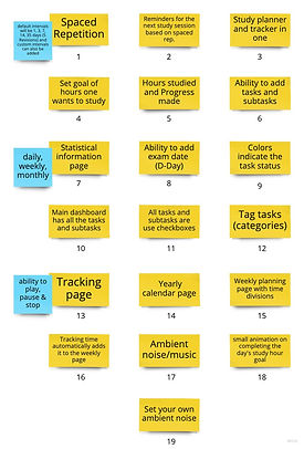
I created an affinity diagram initially, to help me make sense of all the information. One of the other ways I used, was to analyze the raw data by grouping the notes from the interviews and giving them clearly defined labels representing themes and opportunities. I also synthesized the findings through affinity mapping by grouping similarities that I drew from various insights.

Affinity Diagram


Interview notes
Themes & Opportunities
Feature Prioritisation:
After the broad themes were identified, it was time to come up with feature ideas. The process I used is called feature ideation. Then I segregated the ideas on the basis of complexity and the value it will provide. If an idea is too complex but has little value, then it is not worth developing. Only if it gives value will it be logical to develop.
Feature Ideation
03 - DESIGN

Feature Prioritisation
Sketch
After going through the steps above it was time to sketch out my ideas. Sketching allowed me to get out all my ideas on paper, and in the process I gained an intimate insight on what layouts will work before getting digital with it.


Sketches on paper
Wireframes & Lo-fi Prototypes
I translated the paper sketches into wireframes. Creating detailed wireframes helped me make navigation seamless and straightforward. The low fidelity prototypes were created based on the wireframes.


Lo-fi wireframes
I iterated on the wireframes multiple times before getting few users to validate and walk them through the design process (Usability study). Here, my users suggested few aspects, in which the design could be made better. Some suggestions were implemented in the next iterations; but the rest were something that had to be revisited at a later date, probably as additional features in the future.
The Usability study of participant 1 can be downloaded here.

User-flow created while testing the lo-fi prototypes
High-fidelity designs and prototyping
To get to the high fidelity designs, I made multiple moodboards and multiple designs for the same screen with different UI elements. After the user testing of the high fidelity prototypes, I noticed that the users were confused with the various icons I had used. Due to the fact that I had not prototyped all the pages, it caused a little confusion. So ultimately, I decided to fix this problem by creating the pages that I had previously left and thus making the flow better.

←
Checkout the high fidelity prototype.
04 - REFINE
In all the steps above, I tried to iterate as much as possible in each stage.
CONCLUSION
Reflecting on my Learning
The idea for the creation of a study planner app, which uses spaced repetition emerged when I read a blog on the positives of using spaced repetition algorithms for revision. It helps students in committing the study material to their long term memory. So, I was on the lookout for a good app that would satisfy this need. Unfortunately, I couldn't find such an app anywhere online. Having such an app would solve a lot of hassle that students face; when they try to remember large amounts of information for an exam. Spaced repetition has shown to be an effective technique to commit information to our long-term memory.
The process for coming up with the designs had to be evidence-based, as students need a no-nonsense app; that doesn't waste their precious time. The goal was to assist students in the exams and not distract them. Also, it was important to ensure that students did not spend more time than needed in the app. Whilst working on the app, I was introduced to various tools that helped me create the final designs. The tools are namely, Figma, Miro, Google Forms, Lookback and Zeplin. I used a lot of online resources from sites such as Unsplash, Pexels, etc. I also took inspiration from sites such as Dribble and Behance.
Improvements
(1) Due to the covid-19 pandemic it was difficult to recruit the right participants. As a result, I had to interview my family members or friends.Thus, more interviews are required to understand the context from the larger student diaspora.
(2) Need to have more usability testing for the same reason.